The following images show the difference that the gamma value can make in the visual appearance of an image. How these images look on your monitor may be very different from the way they look on another. The original image created on a Macintosh looks approximately like it does on a DEC Alpha with the gamma value changed to 4.0!
If they all look pretty much the same on your monitor, that's probably because there are only a limited number of colors available. Try saving them and viewing them separately with your Web browser shut down (otherwise it gobbles the available colors on monitor with limited bit depth). There is a considerable difference in appearance among these images if color allocation and limited depth do not interfere. For example, the image with gamma=4.0 should look quite washed out.
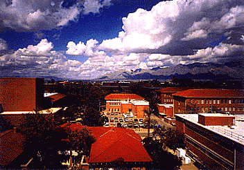
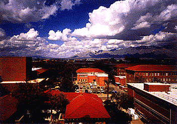
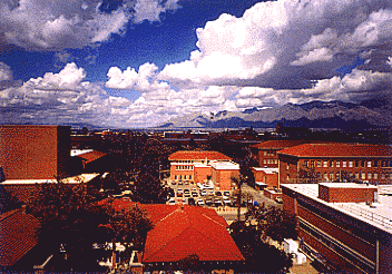
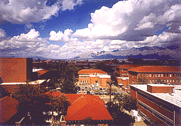
For what it's worth, the original image looks colorful but natural on a Macintosh and similar to the photograph from which it was scanned.
The view in the image is from the Icon Project looking north over The University of Arizona campus to the Catalina Mountains.