VIB: A Visual Interface Builder for Icon; Version 3
Gregg M. Townsend and Mary Cameron
 | Department of Computer
Science
The University of Arizona
Tucson, Arizona
IPD265b
March 14, 1996
http://www.cs.arizona.edu/icon/docs/ipd265.htm |
1. Introduction
Construction of an interactive graphics application can require a large
effort to specify the screen layout. For graphics programs written in Icon
[1,2], VIB eases this part of the project by providing an interactive layout
tool.
An application built by VIB has two parts: the interface specification and
the rest of the program. Both can be contained in the same source file.
VIB edits the interface specification; any text editor can be used to maintain
the rest.
When VIB edits an existing file, it alters only the interface specification
(adding one if necessary) and leaves the rest of the file unmodified. When
VIB creates a new file, it writes a complete program by providing a skeletal
Icon program to accompany the interface specification. This program then
can be edited to give function to the interface.
VIB provides a prototyping facility for testing the interface at any time.
A functional mock-up of the interface is displayed, and activating any of
the input objects produces a message showing the resulting callback. Prototyping
is possible regardless of the state of the Icon code in the file being edited.
In addition to laying out the application as a whole, VIB also can be used
to construct dialog boxes. This process is described in Section 5.
VIB is started by entering the command
vib [filename]
where filename
is the name of an existing Icon source file
or a new one to be created. If filename does not contain a suffix, .icn
is appended. If filename is omitted, VIB generates a name.
2. The Palette
Upon startup, VIB presents a large window containing a menu bar, a palette
of user interface objects, and a work area or canvas.

The palette contains pictorial icons for the following objects, from left
to right:
- Buttons
- are control devices that are activated by pressing the mouse while
over the button. Several forms of buttons are available.
- Radio Buttons
- are collections of buttons such that exactly one button within
the radio button is set at any given time.
- Menus
- are lists of buttons that appear temporarily on the screen and
allow the user to select an item.
- Text Input Fields
- gather textual input from the user. They consist of a label and
an editable value.
- Sliders
- select a scalar value within a range. Sliders can be oriented
vertically or horizontally.
- Scroll Bars
- also select values in a range, but provide buttons at both ends
as well as a slider. Scroll bars can also be oriented vertically or horizontally.
- Regions
- delimit rectangular areas of the window.
- Labels
- display text strings; they do not receive events.
- Lines
- decorate the interface; they do not receive events.
Instances of the objects above can be created by pressing the left mouse
button upon the desired palette object; this creates an object within the
canvas area that then can be dragged into position. Clicking the left mouse
button upon an object selects the object. Selected objects are drawn with
accentuated corners and can be manipulated as follows:
- move
- drag left mouse button from object to new destination.
- nudge
- press an arrow key (up, down, left or right) to move the object
by one pixel.
- resize
- drag left mouse button upon a corner of the object. The opposite
corner is anchored.
- copy
- select
copy
from the edit menu.
- delete
- press the
delete
key or select delete
from the edit
menu.
- align
- select
align vert
or align horz
from
the edit
menu. This causes the mouse cursor to change to a
double-ended arrow; pressing the left mouse button on objects when the cursor
is an arrow moves them as indicated by the arrow to align vertically or
horizontally with the selected object. Pressing the left mouse button on
the window background restores the original cursor.
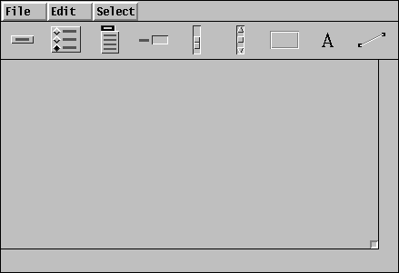
- attributes
- press right mouse button to display (and modify) the attributes
of the object.
Not all objects can be resized, and other objects can be resized only within
certain limits. For example, the size of a radio button is solely determined
by its list of labels, and a slider's length must be at least three times
its width.
In general, objects must not overlap. VIB does not enforce this restriction,
but the results are unpredictable when the program is executed. However,
objects may safely be placed within the interior of a region, allowing the
use of regions for decoration.
VIB follows the standard Icon convention in which the upper-left corner
of the window is at (0, 0), with the x coordinate increasing to the right
and the y coordinate increasing in the downward direction.
The size of the generated interface window can be controlled by the resize
icon that initially appears in lower-right corner of the canvas. This object
can be dragged anywhere within the canvas via the left mouse button. Pressing
the right mouse button over the object pops up an attribute sheet describing
its current dimensions. If the VIB window is resized such that it is smaller
than the interface window, the interface window is automatically made smaller.
If an object instance does not fall entirely within the bounds of the interface
window, it will appear clipped in the generated program as well. That is,
there is no automatic repositioning of objects to fit within the interface
window.
Above the tool palette are three menus. The File
menu provides
the following functionality:
new
- creates a new VIB file.
open
- loads a saved VIB file.
save
- saves the VIB interface to the current file.
save as
- acts like
save
but prompts for a file name.
refresh
- redraws the screen.
prototype
- writes a file with the VIB interface and a skeletal main program,
then translates and executes it. Each callback generated by operating an
object in the prototype window produces a line of output giving the vidget
ID and the value. The prototype is exited by typing
q
in its
window with the mouse cursor not over a region or text object.
quit
- terminates the VIB session.
The Edit
menu provides the following functionality:
copy
- makes a copy of the selected object.
delete
- deletes the selected object.
undelete
- restores the most recently deleted object.
align vert
- aligns objects with the x-coordinate of the selected object.
align horz
- aligns objects with the y-coordinate of the selected object.
The Select
menu lists the ID fields of all the objects, allowing
an object to be selected by name.
Keyboard shortcuts are indicated on the File
and Edit
menus for most items. Holding down the meta key and pressing the appropriate
character is equivalent to choosing the menu item. (The meta key is a special
shift key. It is sometimes labeled with a diamond or propeller or the word
ALT
.) The notation delete @X
on the edit menu,
for example, indicates that meta-X
is the shortcut for delete.
3. Attribute Sheets and Dialogs
VIB displays dialog boxes to specify attributes, gather information, and/or
warn the user. The text fields of these dialog boxes can be edited; the
tab key is used to move among them.
Attribute Sheets
As various objects are created, it usually is necessary to set attributes
to customize the object to suit the needs of the application. The attribute
sheet for an object is displayed by pressing the right mouse button upon
the object. The editable features of an object are object-specific, but
these usually include the x-y location of the object, the name of the object,
a procedure to call when the object receives an event, and so forth. The
Reference Section, later in this document, describes the editable
attributes of each object in particular.
Attribute sheets also contain Okay
and Cancel
buttons. Pressing either of these buttons makes the attribute sheet disappear:
The Okay
button applies changes to the object while the Cancel
button does not. The outline around the Okay
button indicates
that it is the default button on of the attribute sheet; pressing the return
key has the same effect as clicking on the Okay
button using
the mouse.

If the 
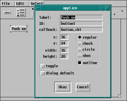
Okay
button is selected VIB checks to ensure that entered
values are valid. For example, if there is no value entered into the x-coordinate
field, an error dialog appears describing this error. The error dialog disappears
when either the Okay
button is selected or the return key is
typed. This in turn redisplays the attribute sheet until the error is corrected
or the Cancel
button is selected.
Dialogs
When opening or saving a VIB interface, VIB displays a dialog box requesting
(or verifying) a file name. If the Okay
button is selected
and the file name has no suffix, VIB appends the suffix .icn
to the name before attempting to access the file. If the file cannot be
opened, an error dialog appears describing the problem. The request can
be canceled by selecting the Cancel
button.
4. The Application Interface
VIB supports the development of event driven applications. When the application
user activates an object on the screen, such as by clicking the mouse over
a button, this event generates a callback to an Icon procedure associated
with the object. The callback procedure for an object is provided separately
by the programmer and its name is specified in the object's attribute sheet.
The parameters depend on the type of object; details are contained in the
reference guide that follows.
The interface specification provided by VIB consists of two Icon procedures
ui_atts()
, which returns a list of attributes for opening the
application window, and ui(win,cbk)
, which creates the objects
on the window. The optional win
parameter supplies a window
on which the interface is to be created. It is usually omitted, in which
case the subject window, &window
, is used. The optional
cbk
parameter provides a default callback procedure to receive
events not processed by interface object callbacks.
The ui()
procedure returns a table of vidgets. There is one
vidget for each interface object, indexed in the table by the ID name from
the object's attribute sheet. There is also a root vidget that is the parent
of all others. The user code that calls ui()
passes this root
vidget to GetEvents()
or ProcessEvent()
.
A simple VIB application, then, has the following outline:
link vsetup
procedure main(args)
# initialization
(WOpen ! ui_atts()) | stop("can't open window")
vidgets := ui()
# sophisticated applications might add or modify
# vidgets here
GetEvents(vidgets["root"], evproc)
end
procedure evproc(e)
# (optional) process Icon events not handled by vidgets
end
# callback procedures
# other procedures
# VIB interface section (procedures ui_att and ui)
If the application is to modify the display or perform computations while
awaiting input, a slightly more complex structure is required. The following
code, which replaces the GetEvents()
call above, allows computation
during the event loop under control of a paused
flag that is
presumably set or cleared by the user:
paused := 1
repeat {
while (*Pending() > 0) | \paused do {
ProcessEvent(vidgets["root"], evproc)
}
# perform a small amount of computation here
}
The skeletal main procedure generated by VIB for new files follows a similar
pattern.
The name ui
can be changed by editing the application attribute
sheet, which is displayed by clicking the right-hand mouse button on the
resize icon in the lower right corner.
5. Building Dialog Boxes
VIB can be used to construct dialog boxes for use in an application. The
code for each dialog box is kept in a separate source file and linked as
part of an application. The application itself need not be constructed using
VIB, and a dialog box created by VIB can be used in more than one application.
Dialog mode is configured using the attribute sheet of the canvas. This
is called up by clicking the right-hand mouse button on the resize icon
in the lower right corner. Checking the dialog window
box enables
dialog mode. The dialog box is named by entering a value in the name
field; this value becomes the name of the generated dialog procedure.
A dialog box must contain at least one button that is not a toggle. Pressing
such a button is the way the user dismisses a dialog box. A dialog box cannot
contain a menu or region; VIB does not prohibit these objects, but they
are ignored when the dialog box is actually created.
To use a dialog box, the application calls the procedure generated by VIB.
The dialog box is then displayed, temporarily obscuring part of the application
window. When the user presses a non-toggle button to dismiss the box, the
dialog procedure returns the label of that button. Additionally, the global
variable dialog_value
is assigned a table containing the values
of the objects in the dialog box. The table is indexed by object ID.
The signature of a dialog procedure is as follows:
procedure dialog_name(win, deftbl)
where win
is the window in which the dialog is to appear and
deftbl
is an optional table of default values. If win
is null, the subject window, &window
, is used. Values in
deftbl
, which is indexed by object ID, provide initial defaults
used when the dialog box is first displayed; initial values set in VIB are
not used.
6. Reference Guide
Buttons
Buttons are control devices that are activated by pressing the mouse while
over the button. They may appear in four different styles: regular, check
box, circle, and xbox. An outline is optional. A button can be flagged as
a toggle, which maintains a state of on or off. The attribute sheet of a
button contains the following editable features:
label
- is the label of the button. This may be an empty string.
ID
- is the name assigned to the object.
callback
- specifies the procedure to call, if any, when the button receives
an event.
x
- specifies the x-coordinate of the upper-left corner of the
button.
y
- specifies the y-coordinate of the upper-left corner of the
button.
width
- specifies the width of the button.
height
- specifies the height of the button.
style
- specifies the appearance of the button. Four styles are supported:
regular, check box, circle, and xbox.
outline
- specifies whether an outline is to be drawn around the button.
toggle
- specifies whether the button is a toggle button.
dialog default
- specifies whether the button is the default button of a dialog
box. Only one button can be designated as the default.
The callback procedure associated with a button is called when the mouse
is pressed and released while over the button. If the mouse is released
while off of the button, no event is sent to the application. The signature
of button callbacks is as follows:
procedure button_cb(vidget, value)
where vidget
is the actual button vidget created by VIB and
value
is the current value of the button. A regular button
does not maintain a state and therefore its value is insignificant. However,
if the button is a toggle, the button does maintain a state. A non-null
value indicates that the button is set or on, while a null value indicates
that the button is off.
Radio Buttons
Radio buttons are collections of buttons in which exactly one button is
set at any given time; an exception is the initial configuration in which
no buttons are set. Selecting one button automatically unsets the previously
highlighted button in the group. The attribute sheet of a radio button contains
the following editable features:
ID
- is the name assigned to the object.
callback
- specifies the procedure to call, if any, when the radio button
receives an event.
x
- specifies the x-coordinate of the upper-left corner of the
radio button.
y
- specifies the y-coordinate of the upper-left corner of the
radio button.
The attribute sheet also contains add
and del
buttons. An add
button inserts a new entry; a del (delete)
button removes an existing entry.
The callback procedure associated with a radio button is called whenever
one of its buttons is pressed. The signature of radio button callbacks is
as follows:
procedure radio_button_cb(vidget, value)
where vidget
is the actual radio button vidget created by VIB
and value
is the current value of the radio button. The value
of the radio button is the label of the currently highlighted button.
Menus
Menus are lists of buttons that appear temporarily on the screen and allow
the user to select one item from a list; they can contain an arbitrary nesting
of submenus. A menu appears when its menu button is pressed. A menu button
is simply the visual representation of the menu that is visible when the
menu is not active. Defining a menu therefore involves two parts: defining
the text and position of the menu button, and defining the menu that is
displayed as the result of pressing on the menu button. The attribute sheet
of a menu provides the means to define the menu contents. The editable features
of a menu are as follows:
menu label
- is the label that appears on the menu button.
ID
- is the name assigned to the object.
callback
- specifies the procedure to call, if any, when a menu item is
selected.
x
- specifies the x-coordinate of the upper-left corner of the
menu button.
y
- specifies the y-coordinate of the upper-left corner of the
menu button.
The attribute sheet also contains add
and del
buttons. An add
button inserts a new entry; a del
(delete) button removes an existing entry.
A create
submenu
button turns a menu entry into
a submenu header and displays an attribute sheet for the submenu. Submenu
attribute sheets function the same way as menu attribute sheets. Submenus
can be nested to arbitrary depth.
An edit
submenu
button appears beside a label
representing an existing submenu header. The button label indicates the
size of the submenu. Pressing the edit button brings up the attribute sheet
for the submenu. A submenu is removed by deleting all of its entries.
Once a menu has been defined, it can be viewed within VIB by pressing the
middle mouse button on the menu button. This allows the appearance and behavior
of the menu to be simulated without fully prototyping the interface. Pressing
the right mouse button on the menu button again displays the attribute sheet
of the menu object, providing a quick edit/simulation cycle.
The callback procedure associated with a menu is called when the menu has
been displayed and the mouse is released while over one of its choices.
The signature of menu callbacks is as follows:
procedure menu_cb(vidget, value)
where vidget
is the actual menu vidget created by VIB and value
is a list of labels defining the menu path of the selected choice. For example,
if the menu has open
and close
as its choices
and open
is selected, ["open"]
will
be the value passed to the callback. If the menu has font
as
a submenu label and Helvetica
as a choice within the submenu,
then ["font", "Helvetica"]
will be the
value if Helvetica
is selected. Thus, choice names need not
be unique across the entire menu, for they can be distinguished by their
path strings.
Text Input Fields
Text input fields are used to gather textual input from the user of the
application. They consist of a label and a value; the value is editable
and can accept a limited number of characters, as specified by the maximum
value length
attribute. The attribute sheet of a text input field
contains the following editable features:
ID
- is the name assigned to the object.
callback
- specifies the procedure to call, if any, when the text input
field receives an event. This happens when the return key is pressed while
the text input field has the focus.
x
- specifies the x-coordinate of the upper-left corner of the
text input field.
y
- specifies the y-coordinate of the upper-left corner of the
text input field.
label
- is the label of the text input field.
value
- is the default value of the text input field.
maximum value length
- specifies the maximum number of characters that the value can
contain.
The callback procedure associated with a text input field is called whenever
the return key is pressed. The signature of text input field callbacks is
as follows:
procedure text_cb(vidget, value)
where vidget
is the actual text vidget created by VIB and value
is the current value of the text input field. The value of the object is
the entered text string.
Sliders and Scroll Bars
Sliders are long rectangular buttons that display one or more scalar values
as positions within a range. When the slidebar is clicked or dragged by
the user, a scalar value is increased or decreased. Scroll bars are similar
to sliders, with the addition of arrow buttons that increment or decrement
the value by a fixed amount.
From a programming standpoint, sliders and scroll bars are very similar,
and they are treated identically by VIB. The attribute sheet contains the
following editable features:
ID
- is the name assigned to the object.
callback
- specifies the procedure to call, if any, when the object receives
an event.
x
- specifies the x-coordinate of the upper-left corner of the
object.
y
- specifies the y-coordinate of the upper-left corner of the
object.
length
- specifies the length of the object.
width
- specifies the width of the object.
left/top
- specifies the left value of the range for horizontal objects
or the top value of the range for vertical objects. This can be a positive
or negative value of type integer or real.
initial
- specifies the initial value of the object. The initial value
must be within the range established by the left/top and right/bottom values.
right/bottom
- specifies the right value of the range for horizontal objects
or the bottom value of the range for vertical objects. This can be a positive
or negative value of type integer or real.
filter
- filters out some of the events sent to the object, if set.
This corresponds to the non-continuous mode as described below.
orientation
- specifies a vertical or horizontal orientation.
The application can control the number of events passed to the object. In
continuous mode, the object receives events as the slidebar is pressed,
dragged, and released. In non-continuous mode, the object receives a single
event indicating the resulting value of the press-drag-release sequence.
The slidebar can also be moved to a new location by clicking anywhere within
the object region. In both modes, this results in the generation of a single
event. The signature of object callbacks is as follows:
procedure object_cb(vidget, value)
where vidget is the actual object vidget created by VIB and value is the
current numeric value of the object.
Regions
Regions are rectangular areas. They can be used for decoration, for receiving
events, or for identifying output areas. (While nothing prevents an application
from drawing anywhere in the window, reserving a space with a region helps
direct the output to the right place.) The attribute sheet of a region contains
the following editable features:
ID
- is the name assigned to the object.
callback
- specifies the procedure to call, if any, when the region receives
an event.
x
- specifies the x-coordinate of the upper-left corner of the
region.
y
- specifies the y-coordinate of the upper-left corner of the
region.
width
- specifies the width of the region.
height
- specifies the height of the region.
border
- specifies the appearance of the region's border: invisible,
sunken, grooved, or raised.
While most interface objects translate events into values that have meaning
to the application, events in a region are sent directly to the callback
procedure. The signature of the callback is as follows:
procedure region_cb(vidget, e, x, y)
where vidget
is the vidget that VIB created, e
is the Icon event code, and x
and y
are the mouse
coordinates at the time of the event.
Labels
Labels display text strings. They do not receive events and do not have
callbacks procedures. The attribute sheet of a label contains the following
editable features:
label
- is the text to display on the screen.
ID
- is the name assigned to the object.
x
- specifies the x-coordinate of the upper-left corner of the
label.
y
- specifies the y-coordinate of the upper-left corner of the
label.
Lines
Lines decorate the interface. They do not receive events and do not have
callback procedures. The attribute sheet of a line contains the following
editable features:
ID
- is the name assigned to the object.
x1
- specifies the x-coordinate of endpoint one.
y1
- specifies the y-coordinate of endpoint one.
x2
- specifies the x-coordinate of endpoint two.
y2
- specifies the y-coordinate of endpoint two.
Acknowledgements
As VIB has evolved, it has benefited greatly from the comments of Ralph
Griswold, Clint Jeffery, Jon Lipp, Ken Walker, and Yarko Tymciurak.
This work was supported in part by the National Science Foundation under
Grant CCR-8901573.
References
1. R. E. Griswold and M. T. Griswold,
The Icon Programming
Language, Prentice-Hall, Inc., Englewood Cliffs, NJ, second edition,
1990.
2. G. M. Townsend, R. E. Griswold and C. L. Jeffery,
Graphics
Facilities for the Icon Programming Language; Version 9.1, The Univ.
of Arizona Icon Project Document IPD268, 1995.
Icon home page