The University of Arizona
Tucson, Arizona
IPD284a
February 13, 1998
http://www.cs.arizona.edu/icon/docs/ipd284.htm
Gregg M. Townsend and Ralph E. Griswold
|
Department of Computer Science The University of Arizona Tucson, Arizona IPD284a February 13, 1998 http://www.cs.arizona.edu/icon/docs/ipd284.htm |
VIB (Visual Interface Builder) is a program for building visual interfaces (GUIs) and custom dialogs for use in Icon programs. A visual interface consists of a canvas on which interface tools are placed. Interface tools are called vidgets (virtual input devices) and include buttons, menus, sliders, and so forth.
User actions on vidgets, such as clicking the mouse on a button or dragging on a slider, cause events. Such events produce callbacks, which are calls to procedures in the application that handle user events.
VIB produces code for the interface. A complete application consists of interface code, event handling procedures, and the functionality for the application itself.
VIB also can construct custom dialogs.
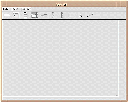
The VIB window has a menu bar at the top. Below this there is a vidget bar with icons representing the various kinds of vidgets. The remaining portion of the VIB window contains the canvas for the interface or dialog, which is indicated by a rectangular area with a box on its lower-right corner.
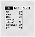
The File menu provides several services related to files
and the overall application:
The new item creates a new file for an interface or dialog.
The open item opens an existing interface file. The save
and save as items write interface files. The refresh
item redraws the canvas, which is needed occasionally if something does
not appear correctly. The prototype item is used to run the
interface or canvas as if were being used in an application. And, of course,
the quit item terminates the VIB session.
A notation like @S indicates a keyboard shortcut for the
item in question. The @ indicates the meta key is to be depressed
while typing the letter (s in this example), which can be upper-
or lowercase.
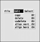
The Edit menu provides services related to manipulating
vidgets:
The copy item copies a vidget, while the delete
item deletes one. The undelete item can be used to restore
the last deleted vidget. The final two items allow vidgets to be visually
aligned.
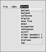
The Select menu allows one of the vidgets to be selected
for manipulation:
VIB provides several kinds of vidgets. These are described below in the order they appear in the vidget bar. Examples of the visual appearances of vidgets accompany the descriptions.
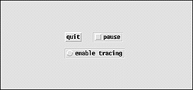
| There are two types of buttons: regular buttons that just produce a callback when pushed and toggle buttons that also maintain an on/off state. Different styles provide different visual appearances for buttons. |
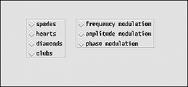
| Radio buttons allow the user to select one of a number of choices. |
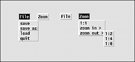
| Menus are buttons concealing lists of items. The items are exposed when the menu's button is pushed. The user then can drag to a desired item to select it. Menus can have submenus. |

| Text lists allow the user to scroll though lines of text and select one or more of them. |
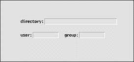
| Text-entry fields provide the user with an area to enter and edit text. |
| Sliders have a thumb that can be moved to select a numerical value within a specified range. Sliders can be oriented vertically or horizontally. |
| Scrollbars perform the same function as sliders, but they have buttons on the ends as well as a thumb for adjusting the position. |
| Regions delimit rectangular areas and can accept user events within those areas. Regions are available in several styles to provide different visual appearances. |
| Labels provide text but do not accept events. |
| Lines can be used to decorate the interface. Lines do not accept events. |
The application canvas is configured by using the box on its lower-right corner. Dragging this box resizes the application canvas. Clicking the right mouse button on this box brings up a dialog:
The dialog window button is checked when a custom dialog instead of an application interface is being constructed. In this case, the name of a procedure for invoking the dialog can be specified. Neither of these are relevant for building an application interface.
Note: The VIB window can be resized using the window manager if it is not large enough to accommodate the application canvas.
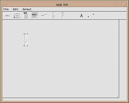
A vidget is created by clicking on its icon in the vidget bar and dragging it into position on the application canvas. It can be repositioned later.
The result of creating and placing a slider vidget is shown below:
Vidgets have a variety of attributes, some of which are common to all vidgets and some that are specific to the type of the vidget. When a vidget is created, it has default attributes. These attributes can be changed later.
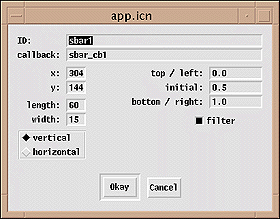
Clicking with the right mouse button on a vidget brings up a dialog showing the vidget's attributes. The default attributes for a slider vidget are shown below:
Every vidget has an ID attribute. Vidgets are identified by their IDs, both in VIB and in the application that uses the interface. All vidgets also have a position, given as the x-y coordinates of its upper-left corner. Most kinds of vidgets have size attributes as well. All vidgets except for labels and lines have a callback attribute that names the application procedure that is called when the user manipulates the vidget. In the case of a slider vidget, there also is an attribute for orienting it vertically or horizontally. Finally, numerical values can be set for the endpoints of the slider, and the filter option controls the circumstances under which the callback procedure is invoked.
The initial default values for vidget attributes usually should be changed. For example, it usually is advisable to choose IDs and callback names that have mnemonic meanings for the vidget in question.
Configuration dialogs for the various kinds of vidgets are given in Appendix A. The attributes of vidgets are described in more detail in Appendix B.
A vidget can be moved or modified only when it is selected. Only one vidget can selected at a time. A vidget can be selected by clicking on it, which highlights its corners to indicate it is selected. When a vidget is selected, any previously selected vidget is deselected. Clicking on the canvas at any place other than on a vidget deselects the currently selected vidget, leaving no vidget selected.
A vidget also can be selected by using the Select menu,
which displays the IDs of all vidgets as shown earlier. This method of selection
is useful if a vidget is "lost" because it is behind another vidget
or because it is too small to be selected by clicking on it.
A vidget can be resized by selecting it, pressing the mouse on one of its four corners, and dragging that corner to a new location. The diagonally opposite corner remains anchored, and the size changes. Some vidgets enforce constraints on resizing. For example, a button cannot be made smaller than its label. Other vidget types, such as menus, cannot be resized at all.
A vidget can be repositioned by selecting it and dragging with the left mouse button depressed. A selected vidget can be moved one pixel at a time by using the arrow keys on the keyboard. This is useful for small movements and precise positioning. A vidget also can be repositioned by using its dialog and changing the x-y coordinates of its upper-left corner.
Vidgets can be aligned by selecting an "anchor" vidget and
the choosing align horiz or align vert from the
Edit menu. Horizontal alignment aligns the left edges of vidgets
with the left edge of the anchor vidget, while vertical alignment aligns
the tops.
When an alignment is chosen from the Edit menu, the mouse
pointer chnages to a shape that indicates horizontal or vertical movement,
corresponding to the type of alignment chosen. Subsequently, clicking on
a vidget aligns it with the anchor vidget. Several vidgets can be aligned
in this manner. Clicking on the canvas off any vidget restores the cursor
to an arrow and its normal functionality.
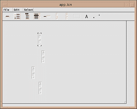
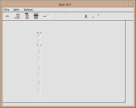
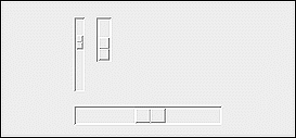
The following image shows four scrollbars that need to be aligned horizontally with the topmost one selected as the anchor:
After selecting align horiz and clicking on each of the
three scrollbars below the anchor, the result is
Note that the anchor vidget still is selected.
The selected vidget can be deleted by choosing delete (@X)
from the Edit menu or by pressing the delete key.
This operation can be undone by choosing undelete (@U)
from the Edit menu, provided no other action has been performed
since the vidget was deleted.
The selected vidget can be copied by choosing copy (@C)
from the Edit menu.
The copied vidget is selected when it is created. It is offset vertically and horizontally from the vidget from which it was copied. Attributes other than the ID, callback, and position are inherited from the vidget from which it was created.
A custom dialog is very similar to a visual interface for an application: Vidgets with various functionalities can be positioned as desired.
There are two noticeable differences between custom dialogs and visual interfaces:
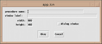
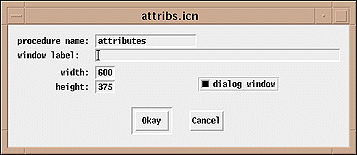
VIB must be told that it is creating a custom dialog rather than a visual interface, which is the default. This is done in the canvas dialog that comes up as a result of clicking with the right mouse button on the lower-right corner of the application canvas.
Two things are needed to create a custom dialog: providing a procedure name by which the dialog will be called and setting the dialog window toggle, as shown in this example:
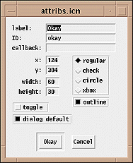
One button can be designated as the default button for dismissing a custom dialog. This is done by setting the dialog default toggle in the attribute dialog for the button:
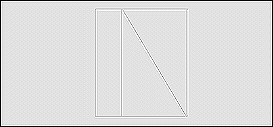
The application canvas as shown by VIB is very similar to the way it appears in an application. The dashed lines that show the boundary of a region with an invisible border do not, of course, show when the visual interface is used in an application.
The exact appearance of the interface can be obtained by selecting prototype
(@P) from the File menu. This constructs and launches
an application with the current interface and a dummy program for handling
events.
Manipulating vidgets on the prototype produces information about callbacks, IDs, and vidget values.
A prototype for a visual interface can be terminated by typing q
with the cursor not on a vidget. The prototype for a custom dialog can be
dismissed by clicking on one of its regular buttons. A dialog is presented
to confirm that you wish to terminate the prototype instead of continuing
to test it.
When the user presses a button, selects an item from a menu, or activates some other interface tool, a procedure associated with the vidget is called. Such procedures are called callbacks because user actions on the interface result in calls back to procedures in the application.
Callback procedures have the following form:
procedure cb(vidget, value)
The first argument identifies the vidget that produced the callback, and the second argument gives a value. The vidget argument is not always needed, but it can be used to distinguish among different vidgets that share the same callback procedure. The value often is important, since in many cases it indicates the nature of the user action.
For a toggle button, the value is null when the toggle is turned off and 1 (nonnull) when it is turned on. This makes testing of the state of a toggle easy, as in
procedure pause_cb(vidget, value)

   if \value then       # stop display
   else                 # continue display

   return

end
The callback value for a radio button is the (string) label of the selected button, as in
procedure shape_cb(vidget, value)

   case value of {
      "discs":         # set shape to filled circle
      "rings":         # set shape to output circle
      }

    return

end
Since menus can have submenus, their callback values are lists whose first elements are the text for the item selected from the main menu, whose second elements are the text for the item selected from the first submenu, and so on. If there are no submenus, the callback value for a menu is a one-element list, as illustrated by
procedure file_cb(vidget, value)

    case value[1] of {
      "snapshot @S":      # take snapshot
      "quit     @Q":      # shut down the application
      }

    return

end
Notice that the list element is the complete text for the item selected.
The callback value for a text-entry field is the text in the field at the time the user presses return with the I-beam cursor in the field. There is no callback until the user presses return.
The callback value for a slider or scrollbar is the numerical value in the given range, as determined by the position of the thumb. A slider or scrollbar can be configured in two ways: to provide callbacks as the user moves the thumb, or "filtered" to provide a callback only when the user releases the thumb. Filtering is appropriate when only the final value is important, as in
procedure density_cb(vidget, value)

    density := value     # set global variable

    return

end
Unfiltered callbacks may be needed when the application needs to respond while the user moves the thumb, as in scrolling an image.
The callback value for a text-list vidget depends on the kind of the text list. If the vidget allows selection of only a single item, the value is the selected line. If the vidget allows multiple selections, the value is a list of the selected lines. There is no callback for a text list that does not allow selection.
The form of callback procedures for regions is somewhat different from the callback procedures for other vidgets. The second argument is the event produced by the user, and there are two additional arguments that indicate where on the application canvas (not the region) the event occurred:
procedure cb(vidget, e, x, y)
Note in particular that e is not a value associated with
the region vidget, as it is for other kinds of vidgets; it is the actual
event, such as a mouse press or a character from the keyboard.
Labels and lines do not produce callbacks; they provide decoration only.
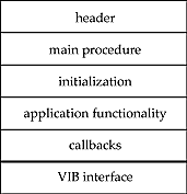
An application with a VIB interface usually has several relatively distinct components:
The sections above the thick line are written by the programmer of the application. VIB produces the section of code below the thick line. It is used to create the interface. Here is a typical example.
#===<<vib:begin>>===    modify using vib; do not remove this marker line
procedure ui_atts()
   return ["size=600,455", "bg=pale gray"]
end

procedure ui(win, cbk)
return vsetup(win, cbk,
   [":Sizer:::0,0,600,455:kaleido",],
   ["file:Menu:pull::12,3,36,21:File",file_cb,
      ["snapshot @S","quit     @Q"]],
   ["label01:Label:::13,180,21,13:min",],
   ["label02:Label:::152,180,21,13:max",],
   ["label03:Label:::13,240,21,13:min",],
   ["label04:Label:::152,240,21,13:max",],
   ["label05:Label:::13,300,21,13:min",],
   ["label06:Label:::152,300,21,13:max",],
   ["label07:Label:::7,120,28,13:slow",],
   ["label08:Label:::151,120,28,13:fast",],
   ["lbl_density:Label:::67,160,49,13:density",],
   ["lbl_max_radius:Label:::43,280,98,13:maximum radius",],
   ["lbl_min_radius:Label:::44,220,98,13:minimum radius",],
   ["lbl_speed:Label:::74,100,35,13:speed",],
   ["line:Line:::0,30,600,30:",],
   ["pause:Button:regular:1:33,55,45,20:pause",pause_cb],
   ["reset:Button:regular::111,55,45,20:reset",reset_cb],
   ["sld_density:Slider:h:1:42,180,100,15:1,100,50",density_cb],
   ["sld_max_radius:Slider:h:1:42,300,100,15:1,230,115",max_radius_cb],
   ["sld_min_radius:Slider:h:1:42,240,100,15:1,230,115",min_radius_cb],
   ["sld_speed:Slider:h:1:42,120,100,15:500,0,250",speed_cb],
   ["region:Rect:raised::188,42,400,400:",],
   )
end
#===<<vib:end>>===	end of section maintained by vib
The procedure ui() in the VIB section opens the application,
draws and initializes the vidgets, and returns a table that contains the
vidget records.
A program with a VIB interface typically begins with
vidgets := ui()
The keys in the table returned by ui() are the vidget IDs.
Their corresponding values are the vidget records. One vidget in the table
returned by ui() is particularly important: a "root"
vidget that encloses all other vidgets and processes events that occur on
them. The root vidget has the ID root.
In an application with a VIB interface, events are not handled by Event()
but by higher-level procedures that understand vidgets and the meaning of
events that occur on them. There are two procedures that handle vidget events,
ProcessEvent() and GetEvents().
ProcessEvent(root, missed, all, resize) processes a single
event. If the event takes place on a vidget and is appropriate for the vidget
(such as a mouse press within the area of a button), a callback for that
vidget occurs. The arguments missed, all, and resize are optional procedures
that are called for events that occur when the mouse pointer is not on a
vidget or are not appropriate for that vidget (such as a keyboard event
with the mouse cursor on a button), for all events, and for resize events,
respectively. For example,
ProcessEvent(root, , shortcuts)
might be used to call shortcuts() for all events in order
to handle keyboard shortcuts that are entered whether the mouse pointer
is on a vidget or not.
The procedure ProcessEvent() is used when an application
wants to handle events one by one. Such programs typically have an event
loop of the form
repeat {
   while *Pending() > 0 do
      ProcessEvent(vidgets["root"])
     # work performed between processing events
   }
In the repeat loop, if there are any pending events, they are processed before going on. This assures prompt response to the user. If no events are pending, other work is done. The amount of computation done before checking again for user events should be small, so as to assure a responsive interface.
The procedure GetEvents(root, missed, all, resize), whose
arguments have the same meaning as those for ProcessEvent(),
handles all events and does not return control to the program. GetEvents()
is appropriate for applications that are entirely "event-driven"
and perform processing only in response to user events and the resulting
callbacks.
A custom dialog is invoked by calling the procedure named in VIB's canvas dialog. The argument of the procedure is a table whose keys are the IDs of the vidgets in the dialog and whose corresponding values are the states of these vidgets.
When a dialog is dismissed, it returns the text of the button used to dismiss it (as for standard dialogs). Before returning, it also changes the values in the table to correspond to the states of the vidgets when the dialog was dismissed.
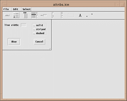
Here's a custom dialog as shown in VIB:
Here's the code for a procedure to use this custom dialog:
link dsetup                      # dialog setup

procedure attribs(win)
   static atts

   initial atts := table()       # table of vidget IDs

   /win := &window

   # Assign values from current attributes.

   atts["linewidth"] := WAttrib(win, "linewidth")
   atts["linestyle"] := WAttrib(win, "linestyle")

   # Call up the dialog.

   repeat {
      attributes(win, atts) == "Okay" | fail
      # Set attributes from table.
      WAttrib(win, "linewidth=" || atts["linewidth"]) | {
         Notice("Invalid linewidth.")
         next
         }
      WAttrib(win, "linestyle=" || atts["linestyle"])
      return
      }

end

#===<<vib:begin>>===   modify using vib; do not remove this marker line
procedure attributes(win, deftbl)
static dstate
initial dstate := dsetup(win,
   ["attributes:Sizer::1:0,0,256,160:",],
   ["cancel:Button:regular::164,102,60,30:Cancel",],
   ["linestyle:Choice::3:155,20,78,63:",,
      ["solid","striped","dashed"]],
   ["linewidth:Text::3:10,20,115,19:line width: \\=",],
   ["okay:Button:regular:-1:31,102,60,30:Okay",],
   )
return dpopup(win, deftbl, dstate)
end
#===<<vib:end>>===   end of section maintained by vib
If the value for the line width is invalid, an attempt to set it fails. If this happens, the user is notified and the dialog is presented again. The radio button choices, on the other hand, are guaranteed to be legal by virtue of the button names used.
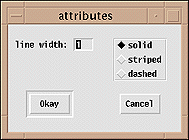
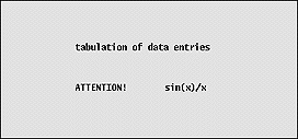
An example of the use of an attribute dialog is
VIB has several limitations that should be considered before designing an interface:
Jon Lipp created the vidgets under Clint Jeffery's direction. Mary Cameron produced the first version of the interface builder as a class project.
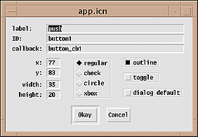
Button Configuration Dialog
The dialog for configuring a button is shown below with initial defaults. The label attribute is what appears on the button. The radio buttons in the center and the outline button at the right provide choices for the visual appearance of the button. The toggle button allows a choice of a regular button or one that maintains an on/off state. The dialog default button is used to designate a default button used to dismiss a custom dialog when the user enters return.
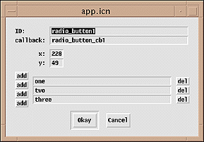
Radio Button Configuration Dialog
The configuration dialog for a set of radio buttons is shown below with
its default values. Three buttons are provided initially with default names.
These names can be changed by editing the text-entry fields. Additional
buttons can be added by clicking on one of the add buttons
that appear at the left; the top and bottom add buttons insert
a field above and below the first and last fields, respectively. The other
add buttons insert fields between existing ones, as indicated by their positions.
The del buttons at the right delete the fields to their immediate
left.
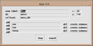
Menu Configuration Dialog
The configuration dialog for a menu is shown below with its default values. Three items are provided initially with default names. The items can be edited and items can be added and deleted in the manner used for radio buttons.
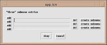
Clicking on create submenu brings up a dialog for a submenu as shown below.
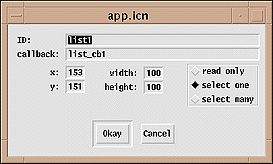
Text-List Configuration Dialog
In the dialog for configuring a text-list vidget, there are three choices for user selection: read only, which allows the user to scroll through the lines but not select any; select one, which allows the user to select a single line; and select many, which allows selection of any or all lines.
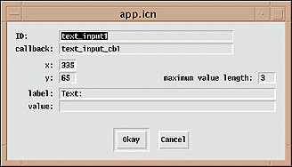
Text-Entry Configuration Dialog
In the dialog for configuring a text-entry vidget, the label field provides for text that appears at the left of the field. An initial value for the text can be entered and the number of characters allowed in the field can be specified.
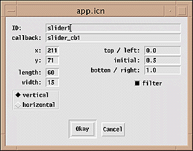
Slider Configuration Dialog
The configuration dialog for a slider vidget allows its dimensions and orientation to be changed as indicated. The default values of the extreme positions of the thumb default to 0.0 and 1.0, allowing scaling in the application. If the filter toggle is on, a callback only occurs when the user releases the thumb. Otherwise, a callback occurs whenever the user moves the thumb.
Scrollbar Configuration Dialog
The configuration dialog for a scrollbar is the same as the dialog for a slider, since the only differences between the two types of vidgets are their visual appearance and the functionality by which the user can change the position of the thumb.
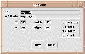
Region Configuration Dialog
The configuration dialog of a region provides four choices for the appearance of the border.
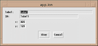
Label Configuration Dialog
Label vidgets are the simplest of all vidgets.
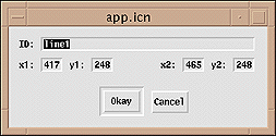
Line Dialog
A line vidget differs from other vidgets in having x,y coordinates for
its end points.
Vidgets are implemented by Icon records, with a different record type for each kind of vidget. The set of vidgets is fixed and there are no provisions for adding new kinds of vidgets.
Vidgets have fields that contain their attributes. Some fields are common to all kinds of vidgets, while some are peculiar to a particular kind of vidget. The attributes of a vidget can be accessed through these fields.
Every vidget has an id field, which is the identifying name
given to the vidget in VIB.
The most commonly used fields are the ones that give the locations and sizes of vidgets:
ax   x coordinate of the upper-left corner of the vidget
ay   y coordinate of the upper-left corner of the vidget
aw   width of the vidget
ah   height of the vidget
The a stands for "absolute". All vidgets except
for lines have these attributes. Lines are specified by their end points:
x1   x coordinate of the beginning of the line
y1   y coordinate of the beginning of the line
x2   x coordinate of the end of the line
y2   y coordinate of the end of the line
Regions also have attributes that give their usable dimensions inside the decorating border they may have:
ux   x coordinate of the upper-left corner of the usable area
uy   y coordinate of the upper-left corner of the usable area
uw   width of the usable area
uh   height of the usable area
The following vidgets can have callbacks. Some maintain states; for these, the values passed generally are the same as their states at the time the callback occurs.
For text lists, the state always is a list of integers; this differs from the callback value. The first integer indexes the top line currently displayed; this reflects the position of the scrollbar thumb. Additional integers, if any, index the currently selected items.
vidget                     state    callback value

regular button                    1
toggle button                x    1 if on, null if off
radio buttons                x    text of selected button
menu                              list of selected items
single-selection text list   x    selected item, or null if nothing is selected
multiple-selection text list x    list of selected items
text-entry                   x    text entered
slider                       x    numerical value for position
scrollbar                    x    numerical value for position
region                            event and the x,y coordinates where it  occurred
The state of some vidgets when they are not activated is indicated visually:
vidget          visual indication

toggle button   highlighted if on (foreground and background reversed),
                  not highlighted if off
radio buttons   selected button highlighted
text list       selected lines highlighted
text-entry      current text displayed
slider          slider thumb position
scrollbar       slider thumb position
A vidget is activated by pressing a mouse button while the mouse pointer is positioned within the area of the vidget. (Note that the entire area occupied by a vidget may not be visually evident.) For a vidget that has a callback procedure, the callback occurs in the following situations following the activation of the vidget:
vidget          callback time

button          when the mouse button is released
radio buttons   when the mouse button is released
menu            when the mouse button is released with the mouse cursor
                  on a selected item
text list       when the mouse button is released
text-entry      when return is entered with the mouse pointer within the field
slider          if unfiltered, when the mouse is dragged on the slider;
                  otherwise when the mouse button is released
scrollbar       if unfiltered, when the mouse is dragged on the slider or
                  released on an end button; otherwise when the mouse button
                  is released
region           when any keyboard or mouse event occurs within the region
The state of some vidgets is indicated visually while they are activated:
vidget          visual indication

button          highlighted (foreground and background reversed)
menu            items pulled down, with the potentially selected one highlighted
radio buttons   selected button highlighted
text list       selected lines highlighted
text-entry      text highlighted
slider          thumb position
scrollbar       thumb position
There is no visual indication when the callback occurs for a slider or scrollbar vidget. The user cannot tell if the vidget is filtered or if a callback only occurs when the mouse button is released. There is no visual indication when a callback occurs when the user finishes with a text-entry vidget. To produce a callback for a text-entry vidget, the user must type return while the I-beam cursor is in the text-entry field. If the user forgets this, no callback occurs. Since this is easy to forget, the user may think there has been a callback to accept the contents of the text-entry field when there has not been one. For this reason, text-entry vidgets are best used in dialogs and not directly on an interface.
For vidgets that have states, VSetState(vidget, state) sets the
state of vidget. It does this by producing a callback to
the vidget as if the
user had done it. Similarly, VGetState(vidget) returns the state
of vidget.
For a text-list or menu vidget, VSetItems(vidget, lst)
sets the list of items for vidget to lst.
Similarly, VGetItems(vidget) returns the current list of items.